My project in Post-production Techniques for Architectural Photography course
by Alex Kachkaev @chelovek
- 1796
- 30
- 4

First of all, thank you Daniel for the course and inspiration!
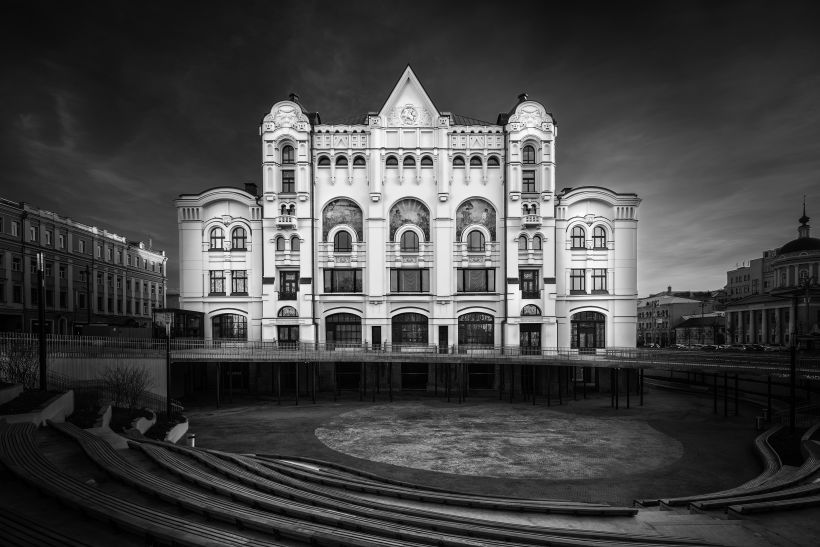
Here's my photo of Polytechnic Museum, one of the major Moscow landmarks. It was under reconstruction for like eight years, facades hidden under construction mesh and banners.
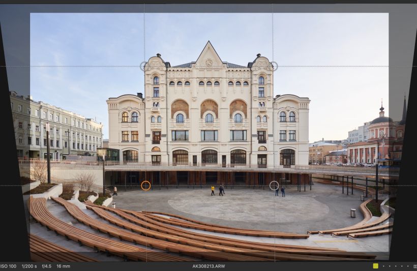
So I picked it for testing your retouching technique, and it was really bad idea. There are almost no volumes in the facade — it is almost 2d, yet look at all these details! So I realised I've got to spend eternity in photoshop with the pen tool, or cheat a bit and use luminosity masks just to slightly increase contrast of the structures. I'm not sure if i mind dirty shadows on the sides of the building, cuz instead if fixing them I'd better find another builing, nice and round, with lots of volumes and with no decorations. There's an awesome Le Corbusier building not far from my place..


4 comments
danielgarayarango
Teacher PlusDear Alex,
I don't find this to be a bad idea at all! You managed to show the beautiful details of the architecture in a natural way, and the fact that you used so much of the surroundings gave you room to play around with the tonalities of the shadows, giving the three-dimensional effect to the image as a whole, more so than if we had only the main subject to watch.
I love the foreground of the little forum and the whole context of the building and I can see a whole series of landmarks such as this, presented in a similar way.
Bravo!
yeskadri
PlusAmazing. Keep it up. Liked the way you have highlighted the subject.
marcos_golfo42
Good morning, I liked the painting course. I was a graphic designer but I never wanted to paint now I wanted to spend time in painting.
See original
Hide original
3dfrontelevation
very nice architecture Building design
Log in or join for Free to comment