Interior Design Tutorial: tips for using color in your home
Learn how to define a color palette and apply the 60-30-10 rule in the low cost decoration of your home with Sofía Savarí O'Keefe
Colors can help us create harmonious and elegant environments, but their combination, as well as their proportion, has to follow a series of guidelines to achieve the best results.
In the following tutorial, Sofía Saraví O'Keefe (@decolookbook), decorator, teaches us how to define a color palette and apply the 60-30-10 rule to design interiors. Discover it below:
1. Tastes and sensations
We all have colors that we like more or less. However, regardless of our aesthetic preferences, each color generates different sensations. Our goal is to determine how to combine and balance these two aspects to create interiors that work visually for us and also create the feelings we are looking for in particular places in our home. Therefore, we need to look at what we like but also what we want to feel.
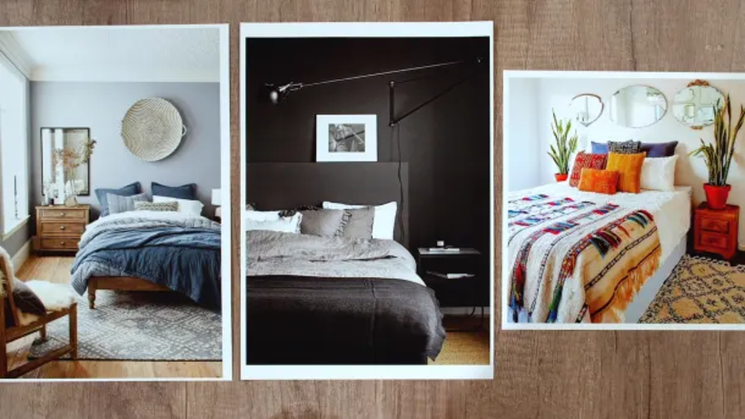
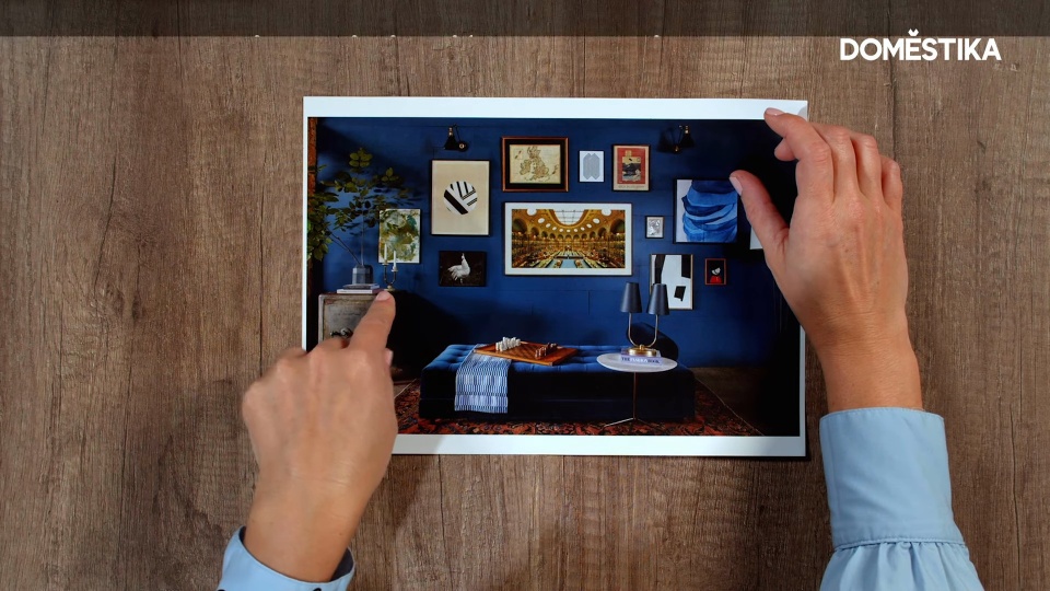
As there are no wrong choices, different colors can work for the same space. For example, whites, blues and greens work very well in a bedroom, as they create a sense of calm and freshness. Black, on the other hand, will convey a sense of elegance and sophistication that can also dress up that space.
2. Start with white
That said, it is advisable to start by using white as the predominant color in your interior design palettes. Although there are no right or wrong options, since it all depends on what we want to achieve in each space, white is the most accessible and neutral color. Therefore, it is best to start with it and, as you become more familiar with interior design and its particularities, you can start playing with other more daring colors such as black, yellow or orange.
3. What do the colors convey?
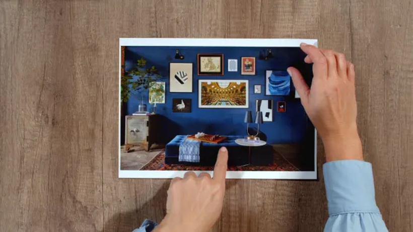
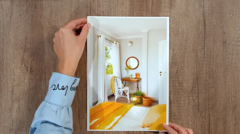
Yellow conveys joy and energy. Orange, like yellow, is the color of energy and creativity. Blue also conveys calm, but at the same time sophistication and elegance.
Green is a very flexible color that can be used in many spaces, as it helps relaxation.
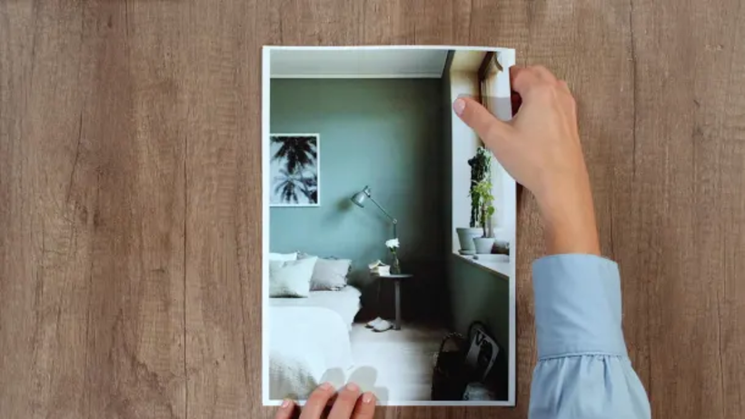
When considering using an eye-catching color, the best thing to do is to ask yourself the question: where do I want to feel that sensation? and choose accordingly.
5. Use the 60-30-10 rule
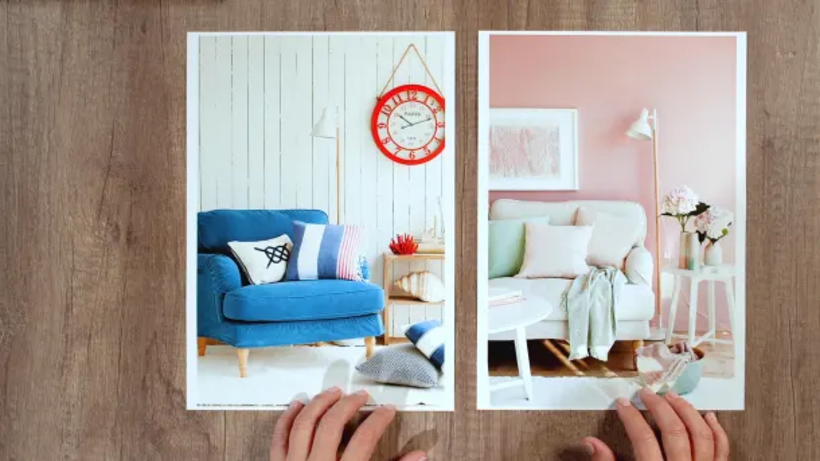
Once you have the colors that are going to be part of your palette, a good way to distribute them is using the 60-30-10 rule as a reference. The idea is that there is a predominant color, which can be the star color or the neutral color of the walls or floors, which occupies 60% of the space to be decorated. A secondary color that usually stands out more would occupy 30%, and the remaining 10% would be occupied by a third more striking color.
This technique does not mean that we always have to use only three colors, but it is a good base from which to start and that allows balanced and harmonious environments chromatically. A good option if we want to use more than three colors is to choose, for example, different shades of the same color or play with different textures.




0 comments