Typography, calligraphy and lettering

Typography Tutorial: OpenType fonts

Discover with Enric Jardí the advantages of using OpenType fonts in your editorial design projects

OpenType is a unique and scalable typographic format, capable of offering a complete range of typefaces, and is also able to adapt to the main operating systems (Windows, Mac and Unix). Enric Jardí, a graphic designer specializing in editorial and typographic design, reveals all his secrets when it comes to getting the most out of OpenType fonts

1. Compatibility between operating systems

Before OpenType fonts appeared, when we moved a project from one operating system to another, there were certain fonts that, being available in both systems, we could use again without any problem. It was the same font, yes, but not exactly the same file, and that could cause problems. This changed with OpenType fonts.

Pro By enricjardi in Typography Tutorial: OpenType fonts 08.03.2024 at 10:33
" href="https://cdn.domestika.org/c_fill,dpr_auto,f_auto,q_auto/v1709890421/content-items/015/095/850/1A-original-original.jpg?1709890421">Different OpenType fonts
Different OpenType fonts

These fonts can be used on a Mac operating system as well as on Windows or Unix, which allows us to share the font when we work, for example, in Illustrator or InDesign and want to change operating systems, preserving both the fonts used and the files.

2. Access to up to 64,000 characters

Pro By enricjardi in Typography Tutorial: OpenType fonts 08.03.2024 at 10:33
" href="https://cdn.domestika.org/c_fill,dpr_auto,f_auto,q_auto/v1709890421/content-items/015/095/852/Artboard_6-original-original.jpg?1709890421">Greek, Russian and Chinese scripts that can be accessed with OpenType
Greek, Russian and Chinese scripts that can be accessed with OpenType

OpenType fonts are prepared to accommodate up to 64,000 characters; this does not necessarily mean that each of them contains that number of characters, but that they are prepared to contain them if necessary.

This allows access to scripts similar to ours, such as Greek or Cyrillic, and others, such as Chinese, which require a much larger number of characters. This feature of OpenType makes it possible to display websites written in Chinese or Japanese, for example, without any problems.

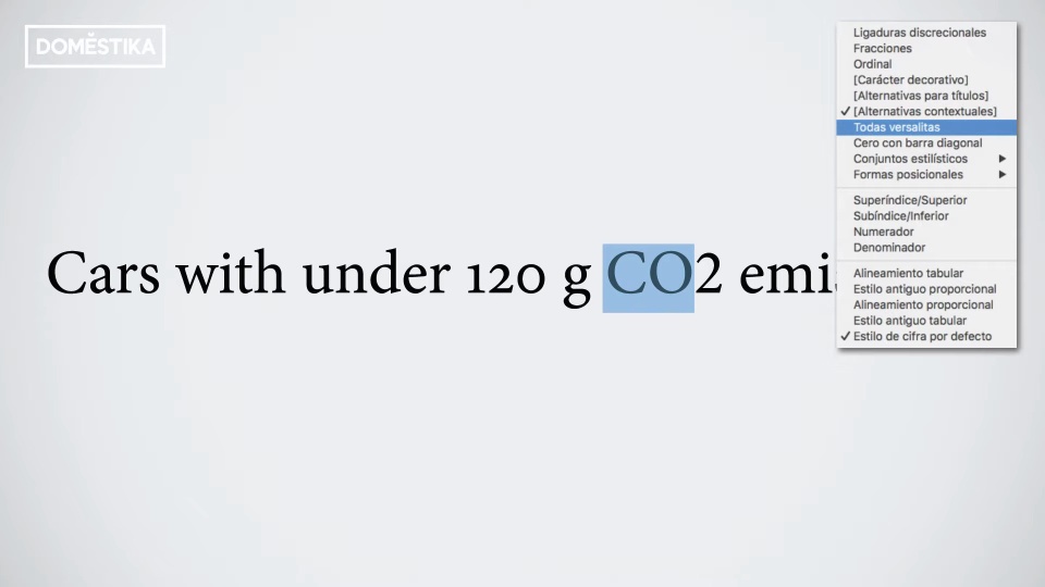
3. Accessing stylistic groups

In some OpenType fonts we can activate parts of the script to make specific characters behave the way we want them to. For example, we can transform a certain group of characters to small caps, giving them a particular style:

Pro By enricjardi in Typography Tutorial: OpenType fonts 08.03.2024 at 10:33
" href="https://cdn.domestika.org/c_fill,dpr_auto,f_auto,q_auto/v1709890421/content-items/015/095/855/Artboard_6-original%2520%25281%2529-original.jpg?1709890421">Applying small caps
Applying small caps

And it also allows numbers to work in a special way, for example, by converting them to superscripts:

Pro By enricjardi in Typography Tutorial: OpenType fonts 08.03.2024 at 10:33
" href="https://cdn.domestika.org/c_fill,dpr_auto,f_auto,q_auto/v1709890421/content-items/015/095/857/Artboard_10-original-original.jpg?1709890421">The 2 becomes a subscript
The 2 becomes a subscript

This can be configured in the character style or paragraph style options, so that we don't have to change the characters every time we need to.

4. Access special characters

Pro By enricjardi in Typography Tutorial: OpenType fonts 08.03.2024 at 10:33
" href="https://cdn.domestika.org/c_fill,dpr_auto,f_auto,q_auto/v1709890421/content-items/015/095/859/6Artboard_1-original-original.jpg?1709890421">Different stylistic groups: simple and decorative ligatures, adapted parentheses and small caps.
Different stylistic groups: simple and decorative ligatures, adapted parentheses and small caps.

OpenType also allows access to other special characters, such as ligatures. With them, we achieve effects, sometimes more ornamental and sometimes simply practical, in the joints between different letters.

Although most fonts have some ligatures, it is the "pro" fonts (such as 'Adobe Garamond Pro', for example) that have options to generate what we call discretionary ligatures: groups of letters linked together with a more ornamental character; or letter shapes that, when positioned at the end of a word, have a different shape; or parentheses that adapt to uppercase or lowercase letters.

In the course 'How to choose typefaces' that Enric Jardí teaches at Domestika, he will show you what each typeface has and how to choose them for your projects; in addition, he will explain how to work with them, showing you the most common mistakes that are made when using them and how to avoid them.

You may also be interested in

- Editorial design: how to make a book, a course by Enric Jardí.
- Basic principles of typographic design, a course by Latinotype.
- Microtypography: basics of typesetting, a course by David Kimura.